What is visualised is realised: models and the fallacy of risk
How mathematical models of infection structure the messages people receive about risk and responsibility.
3 July 2020
Reading time: 7 minutes
In 2022, JUST AI moved to being hosted by the LSE. Learnings from this pilot project have contributed to greater understanding of the challenges and approaches to funding and hosting fellowship programmes, within the Ada Lovelace Institute and in the development of a broader data and AI research and funding community globally.
This post is the second in a series of four examining data, mediation and inequality, on the theme of What is Measured is Managed.
For the past three months, infection curves, peaks and comparisons have become common features of media coverage and public conversation. But what do these representations do to structure – or indeed create – our understanding of the current moment? What ethical and social consequences does seeing this version of our experience create?
The introduction of lockdown and confinement measures in democratic countries has required and invited people to internalise and personalise risk. As these countries try to navigate out of lockdown while minimising ongoing infections, the way that people respond to messages will change the spread of the virus, and health outcomes for populations and people.
Infection curves are abstracted representations of what’s likely to happen in a mathematical model. The purpose of many representations is to model COVID-19’s spread and to support public health strategies that protect people at risk of disease and safeguard health resources.
From the use of curve metaphors as part of efforts to nudge behaviour and ‘flatten the curve’ to fears about ‘second peaks’, the language of mathematical modelling has entered everyday life. But in life, they are absorbed individually, along with other media messages, as guides to personal behaviour.
What’s at stake in reading curves?
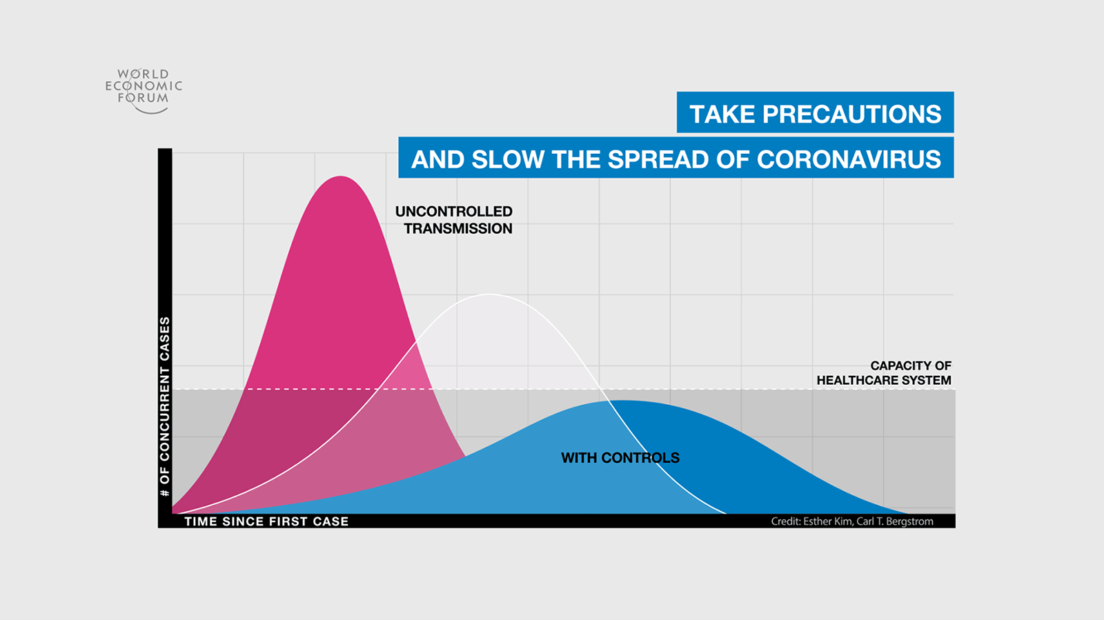
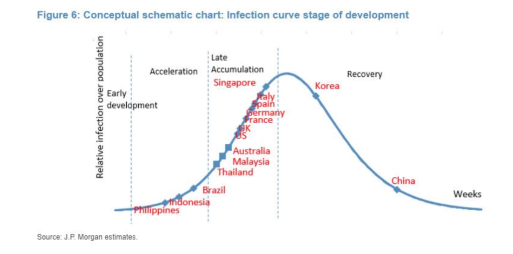
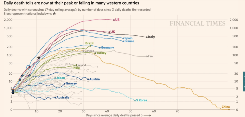
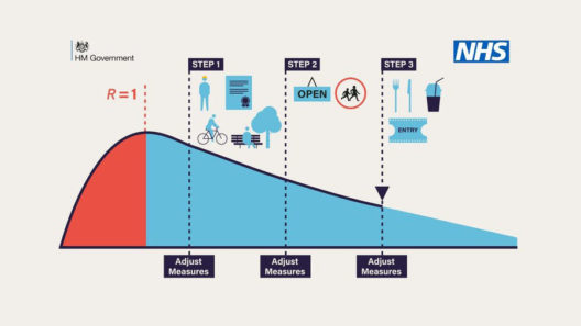
The images here are among those that have circulated frequently over the past months. The first image, of a stylised curve with a peak and fall, suggests that a rise of cases, followed by a fall to 0, is a natural or expected process. The second one, presenting logarithmic graphs of curves from different countries, suggests that infection rates and case numbers should, or will, follow the same patterns everywhere – obscuring the facts that different jurisdictions collect case data in different ways, that the pandemic proceeds along different time periods in different places, and that countries may have interests in presenting their comparative data in ways that make their relative position look better.
As sociologist Helen Kennedy and her co-authors argue, data visualisations are both representational and persuasive: ‘conventions work to imbue visualisations with the quality of objectivity (which brings together other qualities like transparency, scientific-ness and facticity)’ and suggest that visualisations are presenting facts: ‘telling it like it is’. For public understanding of a disease that spreads quickly and often without symptoms, these curves stand in for – become – a key way of understanding a phenomenon that is beyond human scale.
COVID-19 epidemic curves are thus ’potent rhetorical devices which are harnessed for political ends’, to quote Kennedy again. The interactive COVID-19 infection curve model visualising the numbers of infections in different countries ties in to calls issued by government and circulated over social media to ‘flatten the curve’, and encourages the viewer to situate themselves along a comparable trajectory to others, regardless of specific societal context. Comparison to other countries encourages people to place themselves and their families on curves, personalising risks but also obscuring the fact that different places and people experience different processes within this pandemic.
Vernacular appropriation of infection rate curves (which are, we must remember, models generated through the combination of certain mathematical assumptions) reinforces political narratives including the narrative of a fight against an enemy, and the need for collaborative work to ‘flatten’ rates of infection – despite evidence that in many places, including the US and the UK, infection curves have not taken a ‘peak’ form, instead tapering to consistent numbers – these being unrepresentatively high in the case of the USA.
The tendency towards this fallacious interpretation of risk as individual is compounded by confusing decisions on sharing data. On 13 May 2020, the UK Government stopped publishing visualisations of COVID-19 death rates that compared this information across countries. The reason for this may have been systemic differences in how these data are reported in different jurisdictions.
But it might also have been that placing the UK’s death rates on a comparative curve visualisation graphic would show the country’s deaths as following a different, less ‘flat’ trajectory, or one that hadn’t dropped as substantially as hoped. This could have been undertaken , as Helen Kennedy points out, to ‘obscure the exponential rise in UK deaths compared to other countries. Moving goalposts, as commentators noted on Twitter.’ In short, it’s a good demonstration that there is a tacit understanding that permeates society: that epidemiological models and predictions, represented through visualisations, structure reality.
The circulation and representation of epidemiological curves and discussions of ‘epidemic peaks’ has unfortunately reinforced a perceived necessity for individual responsibility for ‘flattening the curve’ and a suggestion that the peaked curve model represents the natural progress of the disease, rather than being a mathematical model employed to explain what might occur.
The metaphor of ‘flattening’ holds another risk: the misunderstanding that reducing the speed of an infection’s spread is the same as eliminating the virus that causes the infection. Looking at some of the kinds of images that appropriate the curve suggests that the folk epistemology associated individual action (mostly staying home) with reductions in cases – or perhaps even with an eradication of the virus itself.
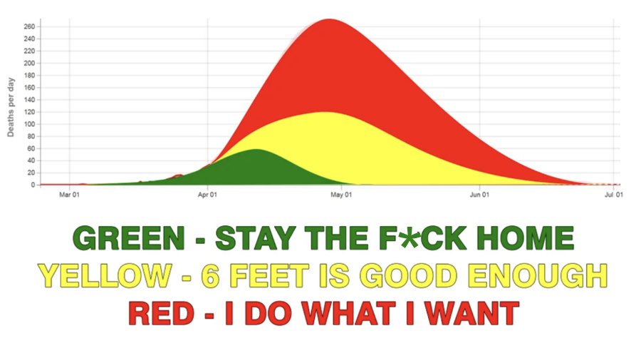
This kind of image also suggests that individual – rather than collective – action is what has influenced the progress of COVID-19. In countries where messaging turns to individual responsibility (such as the UK’s ‘Stay Alert’ messaging and the US debates about mask-wearing as an individual choice) the relative influence of public-health-led strategies for disease control is rarely part of the conversation.
This matters because it can result in a sort of fallacious reasoning, where the probable risk of something occurring is interpreted as the likelihood that it will occur to an individual. Risk modelling refers to generalised probability, not to an individual’s specific risk. For better or worse, as the pandemic progresses, individuals are interpreting risk individually, enacting behaviours based on an individual understanding of personal risk rather than a social understanding that protects others.
Visibility within data intersects with other forms of discrimination. The admonition to ‘stay the f*ck home’ diminishes the risk and danger for people at risk of domestic violence, or the impossibility of complying for those without a home. Staying at home may have changed how and when infection levels changed, but the curves also masked massive inequities in infection rates between affluent and poor areas, between Black and Minority Ethnic and White people, between those who can work from home and those who can’t, and between people who don’t feel safe amid a celebrated re-opening of shops, pubs and restaurants.
A lack of opportunity in the wider population to practice what Kennedy calls ‘“graphicacy”, or the combination of maths, visual literacy, language, computing and critical thinking skills’ may influence a folk epidemiology that misinterprets risk and overstates personal responsibility, to the detriment of understandings of inequality. Poor judgement about these likelihoods and a struggle in understanding the fact that risk is not about what happens to you personally puts moral judgement under strain.
Interpreting risk as if it is directly related to what might happen to us creates one kind of error, which distracts from a systemic or relational view of how our actions might change risk for others. It also intensifies the fallacy of risk as something personally likely, rather than probable at various levels. Without a better understanding and negotiation of risk, misplaced notions of responsibility will mar our collective passage out of this phase of the pandemic.
This post is the second in a series of four examining data, mediation and inequality, on the theme of What is Measured is Managed.
The first in this series of four post investigated data visualisations and inequalities. The third examines the roots of the dashboard effect and details about how it shifts power. The fourth looks at the ethical impacts of the ‘infection curve’ model and the difficulties of transitioning to a more just and equitable mode of life.
Related content
To be seen we must be measured: data visualisation and inequality
How data, bodies and experience entwine.